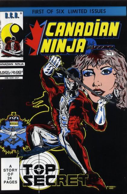
Rogers Beausoleil: Script and Layout. Nathalie Lagace: Inks. Nelson Joly: Letter (sic).
Editions RGB, 1988.
Sometimes the only appropriate response to a thing like this is internet snark.
Quite obviously published during the height of the black-and-white boom-and-bust, it’s hard to tell how much a shoddy piece of junk like this was published out of sheer creative enthusiasm, and how much of it was mercenary. I’ll give you the facts, and you decide.

 If you’ve been feeling like mainstream comics coloring is sometimes over-rendered, hyper-realistic, and/or muddy, you’re not alone. Ron Richards has been very vocal in, er, expressing his displeasure with it on the