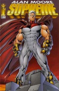
 Join Kumar and Koom as they discuss Alan Moore’s run on the palladium paragon, the alabaster avenger, the archetypical archetype: Rob Liefeld’s Supreme. Kumar tries not to lose it over the Image era ‘artwork’ while Koom attempts to reconcile supremium with revisionist theory. Supreme was Moore’s last outing with a true blue superhero in the classical mould. Both postmodern and nostalgic for lost comic values at the same time, this run sits Janus-like between Moore’s early work and his modern period.
Podcast: Play in new window | Download
This is one of the most interesting unheralded runs of the ’90s. Could not have been happier to see this posted.
But I’m a half-hour in and am probably going to have to stop.
All this is is a bunch of conjecture about what you think went on in the heads of comic creators twenty years ago.
“I think probably Moore got Veitch to do some pencils because the regular pencillers couldn’t keep up. I know Veitch was there even in the first issue, but I still want to say that the other pencillers probably couldn’t do 22 pages per month, because I want to keep saying that.”
“I think Rob Liefeld looked at Melinda Gebbie’s artwork after it came in and said NO WAY, but then Moore caught wind of that and forced Liefeld to use Gebbie’s artwork, and that must be why they had four pages in the back done by a different artist in side-by-side comparison.”
“I think Alan Moore must have had a big fallout with Rob Liefeld and hated him. That’s why the run ended SO SOON.” [Nevermind that 24 issues isn’t exactly “soon” and is actually more consecutive issues of anything Moore had done up to that point except for Swamp Thing. And even counting the ABC titles, Moore would rarely ever do more than 24 issues of any title.]
You might have tried to actually look things up and get facts to base your conjectures on. You say that issue 64 must have been the last issue, but the most basic of searches would have led you to information showing that the series continued for several more issues under Larsen. The idea that issue #63 was printed so late because finally in 2012 Moore was a big enough name is ridiculous. I don’t even know what you guys were trying to say with that. Again, the most basic of web searches would have clued you in to the fact that the script was written but never drawn until Larsen picked it up in 2012.
Potshotting the obvious failings of Rob Liefeld have been commonplace for decades now. This is nothing new or interesting. I can read and hear these kind of remarks anywhere online or in any comic shop.
Moore’s Supreme run — despite and in some sense because of its faults — is an incredibly unique and interesting series. It did the whole Silver Age revamp thing a full decade before the likes of Geoff Johns and Grant Morrison made it a trend and go-to tactic for superhero writers. The whole tactic of having the Clark Kent analogue be a comic artist navigating modern stylistics was genius on Moore’s part. The whole series plays with form and contrasts Silver Age and Modern Age (“Image”) aesthetics. Moore was obviously willing to do this project for years and accept that it would be under Rob Liefeld. He “got over it” before the first issue even came out, and then worked under that condition for two dozen issues. But you as a reader are still permanently hung up on it. Yeah, Liefeld is sort of involved — get the fuck over it. Moore used the Image-era stuff to service the overall effect of what he was trying to do, showing it in contrast to the Veitch artwork, with Sprouse later becoming a synthesis of the two styles. Even if the Image-house-style guys may not have understood what was going on (let’s be really arrogant and assume that they’re just total idiots, since that’s what you need to do), Moore made their talents work as well as possible for what they were and used their stuff to a point, to contrast with the Silver Age. Yes, of course, there were plenty of problems just in terms of basic publishing and printing. The Youngblood issues in particular have all kinds of misplaced word balloons, if I remember right. But who the hell cares when there’s so much else that’s so incredibly interesting and weird going on. Is it the best stuff ever? No. It’s very flawed, but also very unique and weird. It’s so fascinating that this stuff even happened. It sets up the whole ABC line and was like a trial run.
But really all you guys are going to do for 90 minutes is speculate about what might have been going on in people’s heads 20 years ago, base all your opinions on this imagined gossip, ignore the actual storylines of the comics, and tell your listeners the shocking news that Rob Liefeld is a bad artist? What a missed opportunity.
Thanks for your comment. I think you have a legitimate point with some of your criticisms, and I’m wondering if I should have edited this one down somewhat. (Personally, though, I found Kumar’s inability to get over the bad art kind of amusing!)
But I might advise you to not dismiss the entire episode when you’ve only listened to 1/3 of it. You say that you stopped after 30 minutes. If you listen for less than ten minutes past that, you will hear Kumar and Koom get into some of the discussion about the stories, the Silver Age component, etc, that you assumed they did not.
Thanks for the comment, Disappointed.
I would also add that just because people have complained about Liefeld’s art before doesn’t mean it shouldn’t be complained about again. By that logic we should not have mentioned how great Sprouse’s art it, or any of the Silver Age connections since that stuff has already been commented on at length by others too. We’re just two guys saying what we feel.
KS