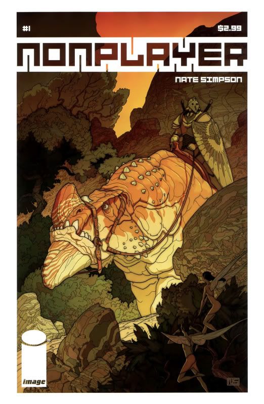
by Nate Simpson
Image Comics, April 2011
I’m going to have to spoil this comic to talk about it, but let me say this first: think about the context in which we normally hear the word “Nonplayer” used, and also consider the fact that Nate Simpson has a background in video game design, and I think you can guess what the twist on page 20 is going to be. It’s issue 1 of 6 anyway, so you might as well find out.
The book begins in a Tolkien-esque landscape full of fantastical creatures. What seems to be royal caravan is attacked by two raiders (one is elf-like) who speak to each other in strangely idiosyncratic terms. During the battle certain strange things happen (apparently beyond the parameters of even the world’s fantastic elements), which even the participants are somewhat confused about. And then we discover that reality is not what we think it is.
SPOILERSPOILERSPOILERSPOILERSPOILERSPOILER
It turns out that the whole fantasy universe is a video game, but “the real world” is itself the future where elements of virtual reality are far more integrated into daily life than they are for us in the present world.
There are several interesting things going on here.
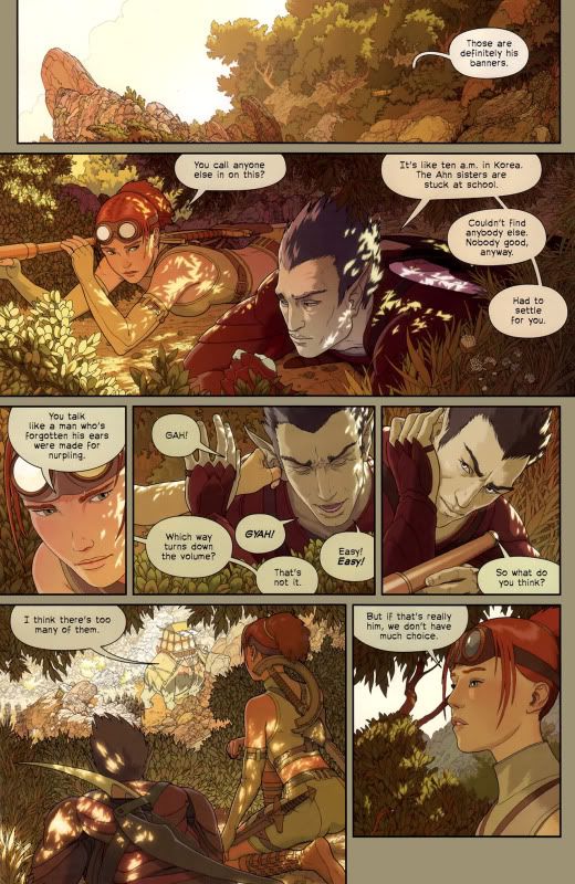
The comic made a big splash when it hit, thanks in particular to a long build-up of buzz for Simpson’s frankly arresting artwork. There is a beautiful attention to certain kinds of detail you don’t normally get in comics, like the way lights shines in between leaves. That makes both the game world and the future world feel tactile and inhabitable, which is critical to the book’s success. It also leads us — already in the book’s first issue — to wonder about the border line between those worlds.
What really surprised me about the art though, was how fluid the layouts were. Simpson has little background in comics, and the tendency of newcomers is to overuse widescreen movie panels (or duplicate panels and only move one thing), or throw panels every shape in the Lego box all over the place. Simpson, however, seems to know exactly what he is doing. Panel boxes are varied in size, but placed regularly until the fight scene when we suddenly get skewed parallelograms. I did feel that the facial expressions were a tiny, tiny, tiny bit stiff, but this is a stupidly nitpicky complaint. The guy can draw anything from any angle and is smart about it.
In terms of the writing, you’re encouraged to go back and read the issue again to reevaluate the dialogue from the first half in light of what you learn later. There’s a great page of the main character getting herself ready in the bathroom over six panels, and it’s all so mundane, “manual,” and “analog.” It really illustrates the difference between her real life and her virtual life. I thought the fight scene ran a little long, but in the real world scenes he packs in quite a few character notes, and it seems he’s obviously going to unpack these as the series progresses. I’m also intrigued to see where he goes with the concept of virtual dependence on virtual reality.
I don’t normally buy single issues of miniseries anymore these days. (I usually wait for the trade and then never get around to buying that when it comes out.) But Simpson works understandably slowly, and who knows when we’ll get to see #2. A year from now? Two years? At any rate, this feels like a comic that was crafted with a lot care and love. If the writing of his overall story arc can live up to the promise of his art, I think we’ll be in for something really special.
KS

————————————————————————————————————
Kumar Sivasubramanian is the writer of Weird Crime Theater.
