by Chris Wisnia
SLG Publishing, 2011
Black & White
One of the big news stories this past week was Dan Vado’s announcement that SLG Publishing was completely phasing out print floppies and switching to digital for their 20-pagers. Which means that you’ll have to get yourself to a computer to read this fine, fine comic (and this review!). Note that downloading Monstrosis #1 is FREE from SLG’s website.
I’m not going to go dissect why SLG have chosen / been forced to go switch to this business model, but it’ll be relevant at the end of this review, so keep it in mind.
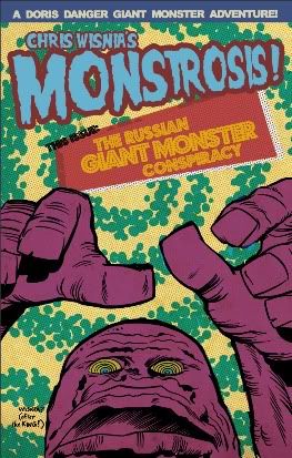
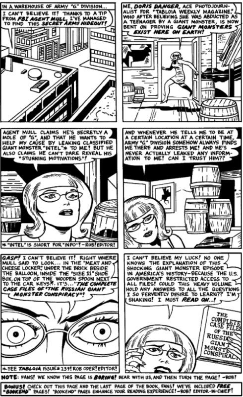
Monstrosis describes itself as a “parody and loving homage, in honor of the most entertaining giant monster horror comics of all time — those of Lee, Lieber, Kirby, and Ayers!” I think the amount of “loving homage” is debatable since Wisnia spends most of his time hilariously ripping the shit out every one of Stan Lee’s narrative “techniques.” Ubiquitous editorial captions relentlessly assume the reader is an idiot with a microscopic attention span, and sometimes refer to hundreds of back issues in a row! Characters have freakish verbal tics which the fictional writer assumed added naturalism, sometimes inside thought balloons. (“Get me?” one character keeps thinking to himself.) The editor himself appears in a cameo. There are frequent mistakes which editorial tries to sell as somehow making the comic “special.” There are endless recaps of previous storylines in reams of dialog in narrative captions.
Editorial is so intrusive, that you get the feeling the fictional Editor of the comic was more responsible for it than the writers or artists, or at least more interested in hogging as much glory from the others as possible. Which, of course, was true of a lot of those early Atlas / Marvel comics.
The art is a hoot too. Wisnia doesn’t homage Kirby, he just swipes him to ridiculous effect. When a character opens a door on page 1 and is floating in mid-air, I knew I was in for something special. The staging is bafflingly illogical at times, with people bouncing all around a room or building during a conversation, and some panels drawn from outer space for “variety.” In true Kirby form (since Wisnia just swiped him after all!) people look perpetually overexcited. My only complaint about the art is that it’s not in color. Since it’s online and not in print, printing costs aren’t an issue and color would make the parody more complete.
If it wasn’t for the humor, this would be one of those Golden Age comics that’s just too damn unintelligible and tedious to read to the end. But I suppose what you get out of this might depend on how familiar you are with those types of comics. In terms of humor, Monstrosis’s closest cousin is Michael Kupperman’s truly excellent Tales Designed to Thrizzle. But Thrizzle’s humor is more broadly understandable. I think Monstrosis’s is most often more specific — you may need to be familiar with the genre to understand its approach.
I know I certainly enjoyed it and there are plugs on the “cover” from Jhonen Vasquez and Dan Clowes — that’s some serious cred! Also, there’s a pin-up section in the back featuring black and white monsters by Nick Cardy, Mike Ploog, and George Tuska. I mean, Holy Shit, right?! How’d those get in here?!
But here’s the thing: if you ever read a Silver Age of Golden Age comic of the type parodied here, what form was it in? Did you read it on an Android Tablet, or did you read it on yellowing, musty newsprint under the covers with a flashlight at summer camp? Maybe you got some of your big brother’s? Or did you read the same three comics at the barber shop over and over again? I’m not saying that’s the way comics should be read or made. But as Jean-Luc Godard once said: “The best way to criticize a movie is to make another movie.” I felt a gaping hole in the experience of reading Monstrosis on a computer screen.
KS


How brilliant is Monstrosis? Well, if you have any love for Fin Fang Foom and his giant monster brethren, very. Kumar’s review is terrific, but there are some other touches worth noting here: The use of “quotes” in all the “wrong” places, which was one of Kirby’s “style” issues … the monster names: Poo-Twah! Wa-Hooie-Wah! and from subsequent issues: Krakkafuzz! Kkk-k (The monstrosity who loves climbing!) Hoo-Hoo! Wutt! … the back stories for the publication that mimic the way the Marvel bullpen used to give readers inside scoops on everything … the sound effects … every panel is dripping with loving homage and a sly sense of humor … I’ve been reading comics since I could buy ’em for 12 cents, and this is one of the most entertaining titles I’ve ever come across. Bravo!!!